 How-to
How to Coordinate Graphics Across a Retail Interior
Last Updated: November 19, 2026
Quick Summary
How to coordinate graphics across a retail interior starts with one graphic hierarchy and one workflow, mapping every surface before design begins. Rank messages from wayfinding down to promotion, and lock a shared spec sheet, measurement worksheet, and production calendar so every location stays consistent.
- Walk the store with a floor plan and camera, listing each surface's size, material, sightline, and job.
- Wayfinding wins every conflict, ranking above brand identity, product zones, and promotion.
- Finalize campaign messaging and approve templates six to eight weeks before the install date.
- Limit window copy to a headline and one supporting line, leaving at least a third of the glass clear.
- Center wall-mounted directional signs at about 60 inches from the floor throughout the store.
Table of Contents
- Start With a Graphic Hierarchy and a Coordination Workflow
- Build a Retail Graphics Rollout Strategy That Scales
- Tie Retail Wall Graphics to Your Interior Palette and Lighting
- Use Retail Window Graphics to Pull Shoppers In From the Street
- Put Retail Visual Merchandising to Work With Floor and Ceiling Graphics
- Make Wayfinding Accessible and Shopper-Friendly
- Specify Materials, Installation, and Replacement Cycles
- Measure Graphic Performance and Plan the Next Update
- Make Every Surface Work Harder
- Frequently Asked Questions
Start With a Graphic Hierarchy and a Coordination Workflow
Most retail interiors fail at graphics for one reason: every surface gets designed on its own. A window here, a wall there, a floor decal added last.
Learning how to coordinate graphics across a retail interior starts with a plan, not a purchase order.
A graphic hierarchy is the ranked order of messages a shopper sees, from essential wayfinding down to seasonal promotion.
Map Every Surface Before You Design Anything
Walk the store with a floor plan and a camera. For an overview of the commercial graphics services that cover walls, windows, and floors, see wall murals, storefront graphics, and floor graphics. Photograph every surface a shopper can see: windows, walls, floors, ceilings, fixtures, and the gaps between them.
List each surface with three notes:
- Size and material (drywall, glass, concrete, tile)
- Sightline (what the shopper sees from the entrance, aisle, and checkout)
- Job (wayfinding, brand story, or promotion)
This map becomes your single source of truth. Designers stop guessing, and installers stop improvising.
Rank Messages From Wayfinding Down to Promotion
Not every message deserves equal space. Rank them in four tiers:
- Wayfinding, restrooms, checkout, pickup, fitting rooms
- Brand identity, logo, tagline, core values
- Product zones, department and category markers
- Promotion, sales, seasonal offers, limited-time messaging
Wayfinding wins every conflict. A shopper who cannot find the checkout will not read your seasonal banner.
Build a Retail Graphics Rollout Strategy That Scales
A retail graphics rollout strategy is the plan that keeps every location consistent while letting each store adapt to its own layout.
The mistake we see most often is treating each store as a fresh design project.
A scalable rollout typically relies on shared resources such as locked templates, brand standards, a common asset library, production spec sheets, and a measurement worksheet for each location.
Lock the Spec Sheet, Not Just the Artwork
Consistency breaks down at production, not design. Two stores can approve the same artwork and still end up with different results if one prints on cast vinyl with a matte laminate and the other uses calendered vinyl with gloss.
Use a Measurement Worksheet Before Design
Each store should submit the same measurements before any artwork is adapted. Ask for:
- Wall width and height at the intended graphic location, plus the height of any obstructions (outlets, thermostats, fire equipment)
- Window glass dimensions and the height of the bottom rail or sill
- Floor zone dimensions and the surface type (sealed concrete, tile, carpet transition)
- Ceiling height and the location of sprinkler heads, lights, and HVAC diffusers
With those numbers, a designer can adapt a template in hours instead of scheduling a site visit. Without them, every store becomes a custom job.
Build a Shared Production Calendar
Rollouts fail on timing as often as on design. Work backward from the install date:
- Six to eight weeks out: finalize campaign messaging and approve templates
- Four weeks out: collect store measurements and confirm quantities per location
- Three weeks out: release print files and order substrates
- Two weeks out: print, laminate, and trim; ship to stores or hold at a central hub
- One week out: confirm install crews and surface prep at each site
Multi-use layouts help too. A wall panel system that accepts swappable inserts lets you refresh promotion without replacing the whole graphic, and it reduces the number of SKUs in the rollout.
Tie Retail Wall Graphics to Your Interior Palette and Lighting
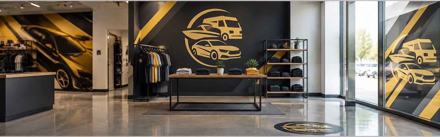
Retail wall graphics work best when they borrow from the room instead of fighting it.

Lighting changes everything. A deep navy reads as black under warm track lighting.
Coordinate wall wraps with fixtures and displays. If shelving is light oak, a graphic with warm neutrals will feel built-in.
For reception areas and large interior walls, our wall murals and interiors service is the place to start.
Use Retail Window Graphics to Pull Shoppers In From the Street
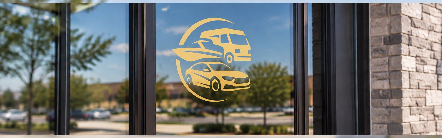
Retail window graphics have one job: stop the passerby. That means fewer words, bigger lettering, and a clear read at speed.
A common mistake is treating the window as a poster. Shoppers moving past at street speed catch three or four words at most. Test your design from across the street, then from a moving car.
Keep these rules in mind:
- Limit window copy to a headline and one supporting line
- Leave at least a third of the glass clear so the interior stays visible
- Use privacy vinyl on lower panels, not full coverage
- Repeat the same core message on every window facing the same traffic flow
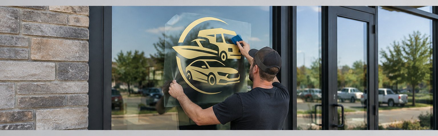
When you are ready to move, our storefront window graphics service handles design through installation.
Put Retail Visual Merchandising to Work With Floor and Ceiling Graphics
Retail visual merchandising is the practice of arranging products and graphics so shoppers move through the store the way you intend.
Floor graphics do three jobs well: they mark zones, they guide traffic, and they carry promotion at eye level. Use them at decision points, like the end of an aisle or the entrance to a department.
Ceiling graphics are underused. Hanging banners and ceiling-mounted directional signs pull shoppers deeper into the store, especially in tall spaces with long sightlines.
To scope floor decals around your surface and traffic, see our floor graphics and decals service.
Make Wayfinding Accessible and Shopper-Friendly
Accessible wayfinding means every shopper can find their way using more than one cue. That includes large text, high contrast, consistent placement at a readable height, and a route plan that works for people using wheelchairs, strollers, or carts.
Most wayfinding guidance stops at "use high contrast." The practical version is more specific, and it is where most retail graphics programs fall short.
Set Type Sizes and Viewing Distances
Legibility depends on distance. A common rule of thumb is one inch of capital letter height for every 10 feet of viewing distance, so a sign read from 30 feet needs roughly 3-inch capitals. For overhead directional signs in a large store, that often means 4- to 6-inch letters.
Keep these rules in mind:
- Use a minimum of 1-inch capital height for signs read within 10 feet, such as department markers
- Use sans-serif type with open counters for directional text; script and condensed faces fail at distance
- Avoid all-caps for long strings; mixed case reads faster
- Keep the ratio of letter height to stroke width moderate; very light weights disappear under glare
Build Contrast Into the Palette
Contrast is not just light-on-dark. It is the measured difference in luminance between text and background. A common target is a contrast ratio of at least 4.5:1 for body text and 3:1 for large text, following the Web Content Accessibility Guidelines (WCAG) contrast thresholds that many accessibility practitioners apply to signage as well.
Pair color coding with text labels, never color alone. A shopper with color vision deficiency may not distinguish a red zone from a green zone, but they can read "Restrooms" and "Checkout."
Mount Signs at a Consistent, Reachable Height
Mount directional signs at a consistent height throughout the store. A common pattern is to center wall-mounted directional signs at about 60 inches from the floor, which keeps them in the field of view for both standing and seated shoppers.
For overhead signs, keep the bottom edge at least 80 inches above the floor to clear head height, and higher in areas with carts or forklifts.
Plan the Route, Not Just the Signs
Shopper flow improves when signs repeat. A shopper who misses the first sign should catch the second one twenty feet later. Walk the store as a shopper would:
- Place signs at decision points, not mid-aisle
- Repeat the same destination cue at each turn
- Keep the path to restrooms, fitting rooms, and checkout free of displays that narrow the route below about 36 inches
- Leave clear space around doorways and ramps so signs do not become obstructions
Use plain words: "Restrooms," not "Comfort Facilities." Pair every symbol with a text label, and keep the symbol set consistent across locations.
Watch out: a sign that meets contrast and size rules can still fail if it is placed where a shopper in a wheelchair cannot see it past a fixture, so check sightlines from a seated height during the walk-through.
Here are the practical wayfinding numbers the article recommends for shopper-friendly signs.
| Item | Value | Note |
|---|---|---|
| Capital letter height rule | 1 inch per 10 feet of viewing distance | 30 feet needs roughly 3-inch capitals |
| Overhead directional letters | 4- to 6-inch letters | For large stores |
| Minimum capital height | 1 inch | Signs read within 10 feet |
| Body text contrast ratio | At least 4.5:1 | Follows WCAG contrast thresholds |
| Large text contrast ratio | At least 3:1 | Follows WCAG contrast thresholds |
| Wall-mounted directional sign height | About 60 inches from floor | Centered, consistent throughout store |
| Overhead sign bottom edge | At least 80 inches above floor | Higher where carts or forklifts operate |
| Clear route width | About 36 inches | Keep path to restrooms, fitting rooms, checkout free |
Specify Materials, Installation, and Replacement Cycles
For seasonal work, our guide to planning seasonal graphics walks through message choice, surfaces, and timing.
Measure Graphic Performance and Plan the Next Update
Graphics are an investment, so treat them like one. Measure what you can, then use the results to plan the next update.
Track a few simple signals:
- Foot traffic counts at entrances before and after a window change
- Dwell time in the zones your floor graphics mark
- Shopper questions at the counter about things a sign should answer
- Photo audits of each location to catch wear and drift
The last one is the easiest and the most ignored. A monthly photo from the same angle shows fading, peeling, and inconsistency faster than any report.
Make Every Surface Work Harder
The real challenge is not choosing a graphic. It is keeping every surface, from the window to the ceiling, telling the same story in the same voice.
That is where a coordinated plan beats a collection of one-off orders. Pearl Wrapz handles design, production, and installation as one process, so your storefront, interior walls, and floors connect instead of compete.
Get started with Pearl Wrapz and turn your retail interior into a brand asset shoppers remember.
Frequently Asked Questions
How do you coordinate wall, window, and floor graphics so they look like one set?
Treat all three surfaces as one graphic package. Pick a single color palette and type family, then assign each surface a job: window graphics attract attention, wall graphics carry brand story, floor graphics handle wayfinding and promotions. Keep the logo size and placement rules identical across surfaces, and review the whole set together before production.
What is the 70/30 rule and does it apply to retail interior graphics?
The 70/30 rule splits a composition into roughly 70 percent dominant element and 30 percent supporting detail. In a retail interior, that usually means 70 percent of visible wall or window space stays calm (brand color, texture, negative space) and 30 percent carries messaging, product callouts, or promotion. It keeps graphics from competing with merchandise. Use it as a starting ratio for each surface, then adjust for the sightline: a window seen at 35 mph needs more contrast and less text than a wall panel shoppers read up close.
How often should retail interior graphics be replaced?
Split graphics into permanent and seasonal tiers. Permanent brand elements such as wall wraps and reception graphics can stay in place for years when the materials suit the surface. Promotional window and floor graphics should turn over with each campaign. Replace any graphic that has faded, curled, or stopped matching the current brand standards.
What materials hold up best on store walls, windows, and floors?
Match the material to the surface and the traffic. Floor, window, and wall graphics each call for different materials depending on the surface and how it is used. Ask for a recommendation based on your specific space before committing to a full install.