 How-to
How to Make Vehicle Graphics Readable: A 2026 Guide
Last Updated: October 23, 2026
Quick Summary
Make vehicle graphics readable by following the 10-by-1 rule: use 1 inch of letter height for every 10 feet of viewing distance. Pair bold, simple fonts with high contrast colors (4.5:1 ratio minimum), keep copy short and punchy, and test designs at actual viewing distances before production.
- Use bold fonts like Helvetica Bold or Futura Bold; avoid thin, script, or condensed typefaces
- Achieve 4.5:1 contrast ratio minimum between text and background, aiming for 7:1 on primary messages
- Follow the 10-by-1 rule: 50 feet away requires 5-inch letters; 60+ feet requires 6+ inches
- Keep messages to three seconds of reading time; remove adjectives and unnecessary words
- Test mockups at actual viewing distance, in direct sun and shade, before sending to production
Table of Contents
- Why Vehicle Graphics Readability Matters for Your Business
- Understand the 10-by-1 Rule and Viewing Distance
- Best Fonts for Vehicle Wraps and Lettering
- Vehicle Wrap Color Contrast: Making Text Pop
- Vehicle Lettering Size and Spacing Guidelines
- Vehicle Wrap Layout Examples and Message Hierarchy
- Design for Quick Reading: Keep Copy Short and Focused
- Test Your Vehicle Graphics Before Production
- Frequently Asked Questions
Why Vehicle Graphics Readability Matters for Your Business
Your vehicle is a moving billboard, working 24/7, but only if your vehicle graphics readable to passersby. Businesses invest in vehicle graphics only to watch them fail because the design ignored one critical factor: people read from a distance, and they read fast.
Readability comes down to a handful of pre-production decisions: font choice, color contrast, text size, and layout. Get one wrong and the entire wrap underperforms; get them right and your vehicle drives calls and foot traffic.
Understand the 10-by-1 Rule and Viewing Distance
The 10-by-1 rule is the foundation of readable vehicle graphics: for every 10 feet of viewing distance, you need 1 inch of letter height. Someone standing 50 feet away needs letters at least 5 inches tall. A vehicle passes in seconds, so there's no time for small, delicate lettering.
Here's how viewing distance changes what works:
- Close viewing (10-20 feet): Parking lots, storefronts, slow traffic. You can use smaller text, around 2-4 inches.
- Medium distance (30-50 feet): Highway speeds, busy streets. Text should be 3-5 inches minimum.
- Far distance (60+ feet): Interstate visibility, distant viewing. Text needs 6+ inches.
Most businesses underestimate viewing distance, designing for how the wrap looks in software rather than from a moving car. Test at actual distances: stand 50 feet away, if you squint, it's too small.
Best Fonts for Vehicle Wraps and Lettering
Font choice makes or breaks readability, some typefaces work on a website but fail on a moving vehicle.
The best fonts for vehicle wraps are bold, simple, and ensure vehicle graphics readable at distance. Thin, delicate, or ornate fonts disappear from far away.
Strong choices for vehicle graphics:
- Helvetica Bold, Clean, professional, proven to work at distance. Used on thousands of wraps for good reason.
- Arial Bold, Similar to Helvetica. Widely available and reliable.
- Futura Bold, Modern, geometric, excellent contrast at distance.
Avoid these common mistakes:
- Thin or light weights (use Bold or Extra Bold instead)
- Script or handwriting fonts (charming up close, unreadable at distance)
- All lowercase (harder to scan quickly than mixed case or uppercase)
The key principle: bold and simple beats decorative and thin.
One or two fonts maximum per vehicle; more creates visual clutter.
Vehicle Wrap Color Contrast: Making Text Pop
High contrast between text and background determines whether someone can read your message while driving past. It's measurable, and it has to survive color-vision differences, glare, and the reflective behavior of wrap vinyl.
Color contrast means the difference in luminance (brightness) between text and background. Hue matters less than most people think: two colors can look different to you yet nearly identical to a viewer with color-vision deficiency, or wash out to the same gray under harsh sun.
Start with a measurable contrast ratio
Web accessibility standards give you a free benchmark. The Web Content Accessibility Guidelines (WCAG) 2.1, published by the W3C, define contrast ratios: 4.5:1 for normal text and 3:1 for large text (Understanding Success Criterion 1.4.3: Contrast (Minimum) | WAI). For vehicle graphics, treat 4.5:1 as a floor for primary messaging and push toward 7:1 or higher. Free contrast checkers return the ratio from hex codes; run every text/background pair through one before approving a proof, and if it lands below 4.5:1, change a color, usually the background, since text color is often locked to brand guidelines.
Design for color-vision deficiency, not just your own eyes
Roughly 1 in 12 men and 1 in 200 women have some form of color-vision deficiency, most commonly red-green. A red headline on a green background can collapse into a single muddy tone for a meaningful share of viewers.
Practical rules that hold up:
- Vary lightness, not just hue. A dark navy text on a light sky-blue background reads for almost everyone because the luminance gap is large. Red on green fails because the two colors can share similar lightness.
- Avoid relying on color alone to carry meaning. If a phone number is highlighted in red to signal "call now," add a word ("CALL") or an icon so the cue survives for viewers who cannot distinguish the color.
- Test with a simulator. Free color-blindness simulators preview your palette under deuteranopia, protanopia, and tritanopia, catching pairings that look fine to you but fail for a chunk of your audience.
Strong and weak pairings, with the reason
The strongest contrast combinations:
- White text on dark backgrounds (navy, black, dark green), high luminance gap, works in most lighting.
- Black text on light backgrounds (white, yellow, light gray), the classic maximum-contrast pairing.
- Yellow text on dark backgrounds, excellent visibility; this is why safety and road signage leans on it.
Weak contrast combinations to avoid:
- Red on dark blue, similar luminance, and a common failure for red-green viewers.
- Light gray on white, looks elegant on screen, disappears at distance.
- Similar hues (blue on teal, red on orange), low luminance separation even when the hues differ.
Account for lighting, glare, and material
Contrast in a design file is not contrast on a vehicle. Afternoon sun compresses the difference between light colors, gloss laminate reflects more than matte and can wash out light text, and dark colors shift slightly over time.
Practical workflow: check the contrast ratio, simulate color-vision deficiency, then view a physical proof in direct sun, shade, and artificial light. If any condition breaks readability, adjust before production.
Contrast checks and color-vision simulation are important steps that can prevent costly reprints.
Vehicle Lettering Size and Spacing Guidelines
Text size and spacing work together: big text means nothing if the letters run together.
Letter height guidelines by use case:
| Use Case | Viewing Distance | Minimum Letter Height |
|---|---|---|
| Parking lot visibility | 20-30 feet | 2-3 inches |
| Local street traffic | 30-50 feet | 3-5 inches |
| Highway/interstate | 60+ feet | 6+ inches |
| Contact info (secondary) | Any | 1-2 inches smaller than primary message |
Spacing matters as much as size. Letters need breathing room.
Spacing best practices:
- Letter spacing: Leave space equal to about 10-15% of letter height between characters
- Line spacing: Leave space equal to 25-30% of letter height between lines
- Word spacing: Slightly more space than letter spacing
Cramped text is hard to parse while moving; clear separation lets people read quickly.
Keep your message short, a 3-word message with big letters and good spacing beats a 10-word message crammed into the same space.
Vehicle Wrap Layout Examples and Message Hierarchy
Layout determines what people read first, second, and third, not everything deserves equal visual weight.
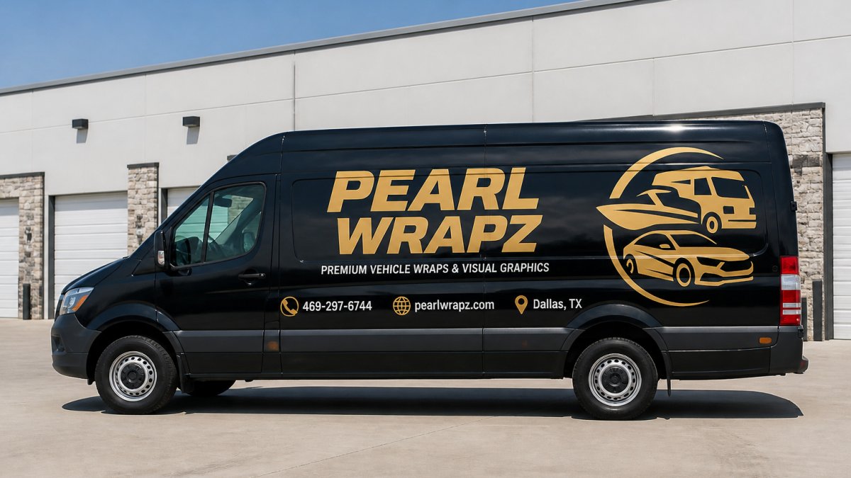
Message hierarchy means organizing information by importance: your primary message dominates, while contact details and website are smaller and less prominent.
A typical effective layout follows this structure:
-
Primary message (largest, most visible)
- Your business name or main offer
- Uses 50-60% of available space
- Positioned at eye level on the vehicle
-
Secondary message (medium size)
- What you do or key benefit
- Uses 25-30% of space
- Supports the primary message
-
Contact information (smallest)
- Phone number, website, or call-to-action
- Uses 10-15% of space
- Bottom corner or side panel
Avoid these layout mistakes:
- Spreading information evenly (no clear hierarchy)
- Placing text too high or too low on the vehicle
- Running text along curved surfaces (distorts readability)
Layouts should account for vehicle curves, door seams, and wheel wells. These features can break up your message if not planned carefully. Work with a designer who understands vehicle geometry.
Design for Quick Reading: Keep Copy Short and Focused
People don't read vehicle graphics. They glance at them. You have three seconds, maybe less.
Every word must earn its place: long taglines and detailed descriptions fail; short, punchy copy wins.
The three-second test: Read your message aloud at normal conversation speed.
Examples of effective vehicle copy:
- "PIZZA DELIVERY • 555-0123"
- "PLUMBING • EMERGENCY SERVICE"
- "CARPET CLEANING • CALL NOW"
Examples that fail the three-second test:
- "Premium pizza delivery service bringing hot, fresh pies to your door since 2015"
- "Professional plumbing solutions for all your residential and commercial needs"
- "Award-winning carpet cleaning specialists serving the community with care"
Your message should be a noun and a verb, maybe one adjective.
Contact information should be equally simple. Phone number and website. Nothing more.
Test Your Vehicle Graphics Before Production
Testing separates professional results from expensive mistakes. Never send a design to production without validating readability in real-world conditions, and never validate only on a screen.
Phase 1: Validate readability in the real world
Step 3: Test in different lighting. View the mockup in direct sun, shade, and artificial light, colors shift dramatically.
Step 4: Check from different angles. Walk around the mockup and view it from left, right, above, and below, curved surfaces distort text.
Step 6: Validate color contrast. Use an online contrast checker: 4.5:1 is a reasonable floor for vehicle graphics; push higher for primary messaging.
Phase 2: Run the vehicle-specific production checks
A flat-wall mockup doesn't show what happens when the design meets a door seam, wheel well, or curved quarter panel. Before production, work through the vehicle itself.
Use a vehicle template. Most wrap software includes manufacturer-specific templates mapping actual panel shapes, seams, handles, and wheel arches.
Measure the panels. Confirm printable area on each panel.
Review a physical proof, not just a PDF. Ask for a printed proof or small-scale print of key panels, check color accuracy against brand colors, confirm contrast holds in print, and approve in writing before production.
Phase 3: Test low-light and nighttime visibility
If your vehicle is on the road after dark, daytime testing is only half the job. Headlights, streetlights, and glare change how colors and contrast read.
- View the proof under low light. Dim the room or view the mockup at dusk; light text on a dark background often holds up better at night.
- Consider reflective materials for safety-critical graphics. Reflective vinyl returns light to the viewer and is common on emergency vehicles. For commercial fleets, reflective accents on key contact information improve nighttime legibility, but confirm local rules before adding elements that could be mistaken for emergency markings.
- Check rain and glare. Wet vinyl reflects more light, and gloss laminate can wash out light text. If your vehicle operates in rain or at night, favor matte laminate and high-luminance contrast.
Phase 4: Plan for measurement after launch
Readability testing doesn't end at production. To know whether the graphics generate responses, build measurement into the design:
- Use a trackable URL or dedicated landing page so you can see how many visits come from the vehicle.
- Use a dedicated phone number (call tracking) if phone calls are the primary response.
- Place a QR code only where viewers will be stationary, a parked vehicle, a storefront, a trailer, not on a moving panel where no one can scan it safely.
Readability testing and vehicle-specific proof review are important steps in any design proposal. The seams and the nighttime view are where most designs fail, and where a little testing saves the most money.
Frequently Asked Questions
How can I make vehicle graphics readable from a distance?
Use the 10-by-1 rule: for every 10 feet of viewing distance, your letter height should be at least 1 inch. Bold, sans-serif fonts with high contrast between text and background are essential. Keep your message to 3-5 words maximum so viewers can read it in the 3-5 seconds they have while your vehicle passes. Avoid thin fonts, script lettering, and busy backgrounds that reduce legibility.
What is the best font for vehicle wraps?
Sans-serif fonts like Helvetica, Arial, and Futura are industry standards for vehicle wraps because they're clean, bold, and readable at speed. Avoid serif fonts, script, and decorative typefaces that become illegible from a distance or when moving. Choose fonts with consistent stroke weight and wide letter spacing to maintain clarity on curved vehicle surfaces and at various viewing angles.
What colors make vehicle lettering easier to read?
High contrast is non-negotiable for vehicle wrap color contrast. The strongest combinations are black text on white, white text on dark blue or black, and yellow text on dark backgrounds. Avoid similar-value color pairs like red on purple or light gray on white. Test your color combination from 50+ feet away in both daylight and evening conditions to ensure accessibility for viewers with color-vision deficiency.
How large should lettering be on a vehicle?
Apply the 10-by-1 rule: 1 inch of letter height for every 10 feet of intended viewing distance. For a vehicle wrap meant to be read from 60 feet away, use 6-inch letters minimum. For closer reading (storefronts, parking lots), 3-4 inch letters work. Measure actual letter height, not font size in points. Test your vehicle lettering size and spacing on a mockup or sample before full production to confirm readability at your target distance.